I managed to get the project done relatively quickly this month in comparison to my previous efforts this year. I’m not sure if that speaks to the relative simplicity of the concept / structure; or, maybe I realized that the end of this month was looking frightfully busy so I needed to knock this one out fast!
The Flag Book
As has been well-established thus far, my goal with the AYBE projects this year has been to execute a structure that I have never ever done before… provided that one of those structures makes sense to the concept. Otherwise, my intent has been to keep exercising my fledgling pop-up muscle!
The Flag Book… I’ve never made one of those before. Always thought they looked fun, and have frequently overheard others in my bookbinding circle yearning for workshops on this structure. I became intrigued.
Of course I invested in the Hedi Kyle book The Art of the Fold when it first came out in 2018. Hedi is known far and wide as a paper folding genius. (I even had the great honour of being a student in one of her workshops many years ago – but that detail is for another day and another blog!) The book is a compendium of her “greatest hits”, and it does include a chapter on the Flag Book. I love how she describes the structure… “it is a portable, expandable file that can display an array of materials in an animated way.” Basically, it is a book that has an accordion as its spine, and single leaves are adhered to the mountains / valleys of the accordion. The accordion, therefore, acts as both spine and hinge. Well that is pretty cool, but consider this unexpected extra bit of coolness:
“Known as a noisemaker when the flags are shaken back and forth, the Flag Book was one of the pioneering structures that opened up a new field for book artists. It was engineered with the idea in mind to capture ‘bookness” without traditional limits.
~ Hedi Kyle, The Art of the Book
In her preface, Hedi speaks to the origin of the Flag Book. It was, in fact, her very first folded book structure – how neat is that?! It now seems even more fitting that my AYBE project should be based on the design that led to Hedi’s amazing journey – after all, isn’t that what school does for all of us?
The School Concept
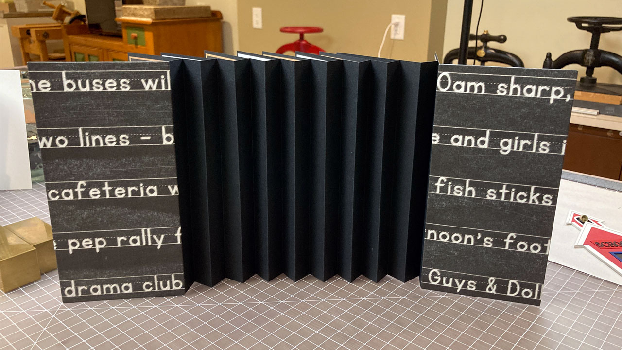
I wanted my book to have the look and feel of school… elementary school in particular. Those first grade experiences hold lasting impressions! I wanted the book to look like a blackboard – so real that you can almost smell the chalk! And I wanted it to conjure up memories – the odd things that one remembers from those childhood school days. The more I thought about my concept, the more my sense memory kicked in: the sound of chalk writing on a blackboard; the shuffling of flash cards; that weird little wire thing the teacher used to draw lines on the blackboard; world maps retracting onto rollers mounted to the ceiling; and, that crazy, crackly intercom blaring the national anthem, the pledge of allegiance, and those daily announcements first thing in the morning!
It’s not so much that I set out to make a Flag Book and made the concept to fit the structure, it was more organic than that. I had all these little school images that I wanted to display, and I knew there would be a lot of them. What structure can showcase a lot of little things and have them represent the whole? The Flag Book – it was the perfect fit. So, with Hedi Kyle’s book in hand, I settled in with my prescribed materials and proceeded to make my first mock-up.
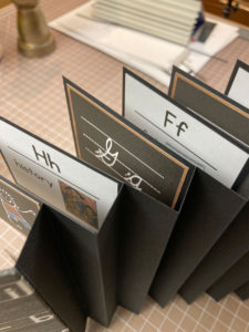
The book would be all about the A-B-C’s. Printed letters (upper case and lower case) would appear on flash cards; and how to form the letters in cursive hand would be presented on little blackboards. I would need enough flags for every letter in the alphabet.
The Flag Book: Project Planning
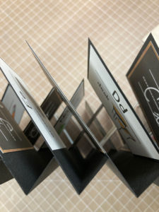
While the execution of the flag book is really quite simple, until you make one, you don’t realize that there is a fair amount of planning involved. How many rows of flags will there be? How many folds in the accordion spine? What will be the size of the flags – will they be uniform or random?
As I discovered, one challenge of this structure is that the flags do overlap one another. So when open and on display in a linear fashion, all the flags in one row partially obscure the flag below it… particularly true when the flags are uniformly sized. I had not appreciated that. If the book is displayed in a semi-circular fashion, this does improve upon this short-coming somewhat. Nevertheless, this is a critical point when planning a flag book – particularly if it is to have written content.
Additionally, the flags of every other row lean in the opposite direction – so content must be justified right or justified left accordingly.
School Days: Design & Execution
The book content was generated thanks to the availability of free clip-art and fonts reminiscent of chalkboard lettering. I designed two templates, one for the blackboard panels and one for the flash card panels. Then it was a matter of creating a panel for each letter of the alphabet for both types of panels.
There were two panels for every flag in the design. This is important point #2: Each flag in a flag book needs a spacer to offset the thickness of the accordion spine! My panels acted as the spacers. As a result, my book is a uniform depth at both spine and fore-edge.
To ensure the content of each flag panel was discernible, I elected to alternate which panel was on the front of the flag and which panel was on the back. This gave the interior of my book an intentional black-white appearance.
With respect to the cover boards, I thought some humour could be injected by generating endpapers with the dreaded “I will not talk in class” statement. The line is repeated 50 times – as I recall the real punishment was usually 100 times! (I don’t know if teachers do that anymore, but I certainly lived in fear of that humiliation!)
I wanted to have a unique covering paper and ended up generating that as well. I came up with some statements that were typically heard over the PA system: when the buses were leaving for the field trip; the day of the next pep rally; try outs for the drama club; & fish sticks on the cafeteria menu… fish sticks were a staple at our cafeteria! I used the chalkboard font to make these statements, but found that they really didn’t look smudgy enough… too pristine! Even all the Photoshop tricks I know didn’t really result in an authentic looking chalky-chalkboard. So, I took care of that. I printed the cover art as is and then took real chalk and smudged it allover the print. Then I rubbed the chalk off with a soft rag and.. voila! Quite the authentic looking outcome. The chalked print was then sealed with a fixative to ensure stability.
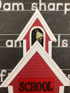
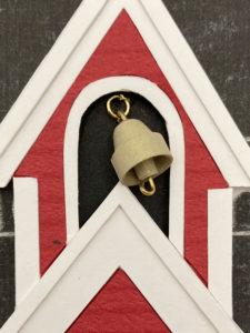
Books usually have titles, but that would mean a lot of words on a cover that already had a lot of words. Instead, I elected to add a 3D little red school-house emblazoned with the word “School”. The school house was assembled from bits of mat board, cover stock, and mylar… and the school bell in the cupola was quilled from a piece of luminescent paper in a bronze tone.
Overall, I would say the finished book well reflects the words from the classic Chuck Berry school anthem
“Up in the mornin’ and out to school, the teacher is teachin’ the Golden Rule. American history and practical math, you study ’em hard and hopin’ to pass. Workin’ your fingers right to the bone, and the guy behind you won’t leave you alone. Ring, ring goes the bell…”
~ Chuck Berry, Hail, Hail Rock ‘n Roll
Barb